Pattern Clash in Unique Layout Design
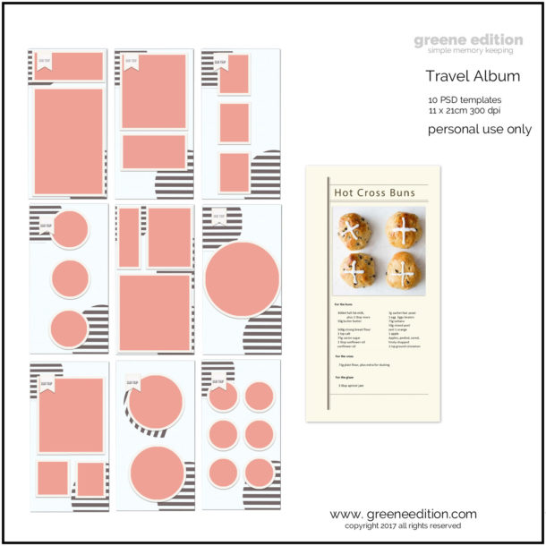
credits: graphics Marisa Lerin, Creations by Robyn, craftastrophic, digital scrapbook ingredients, greene edition
Scrapbookers and memory keepers are always looking for new ways to add visual interest to their layouts. One interesting technique that is becoming more popular is the use of pattern clashes. Pattern clashes are when two or more patterns are used together in a design, resulting in a unique and eye-catching look.
If you are interested in using pattern clashes in your own layouts, there are a few things to keep in mind. First, make sure that the patterns you select have different scale. That is, one pattern should be much larger or much smaller than the other. Second, choose patterns with different colors or value contrast. This will help the patterns stand out against each other. And finally, make sure the patterns have a different level of busy-ness. That is, one should be busy with a lot of small details while the other is more simple.

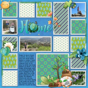
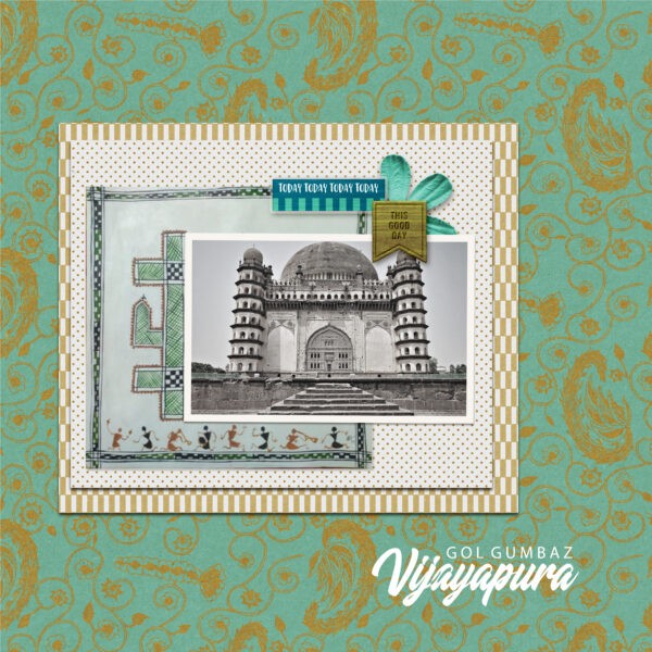
In this layout the orange paisley ties in with the busy mat, the ethnic black and white print balances and anchors the layout.
When used effectively, pattern clashes can add a fun and unique touch to any design. So next time you are looking to add some visual interest to your work, consider using this technique.
1 How to Use Pattern Clash in a Unique Design
2 The concept of pattern clash
3 How pattern clash can be used to create a unique design
4 How to select patterns that will work well together
5 Successfully incorporating pattern clash into a design
6 Ways to use pattern clash to add interest to a space
7 Examples of successful pattern clash designs
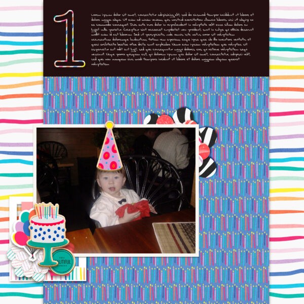
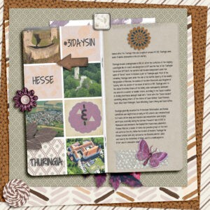
Thanks to Deanne Patterson for this layout! Deanne uses a grid and limited colors, typography and small clusters for this pattern clashing scrapbook page.
1 How to use pattern clash to create a unique layout design
Incorporating pattern clashes into your design can add visual interest and help you to create a unique, one-of-a-kind space. When done correctly, pattern clashes can be eye-catching and stylish. Here are some tips on how to use pattern clashes in a unique design:
Choose two or three patterns that you love and that work well together. Make sure to choose patterns in different colors, scale, and texture to create visual interest.
Layer the patterns. Start with a larger scale pattern and add a smaller scale pattern on top. Add a third layer with an even smaller scale pattern. This will create depth and interest.
Be intentional with your placement. Place the patterns in an interesting way that catches the eye. Try overlapping the patterns or creating a repeated pattern across different surfaces.
Edit and refine. Once you have placed the patterns, step back and take a look. Edit and refine the placement of the patterns until you are happy with the results. By following these tips, you can easily incorporate pattern clashes into your design to create a unique and stylish space.
2 The concept of pattern clash
Most people are familiar with the basic concept of pattern clashes – combining two or more patterns to create a unique look. But what exactly is a pattern clash? And how can you use it to create a unique design?
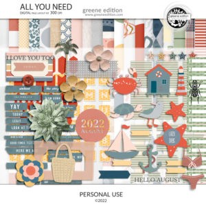
pattern clash by Bina Greene graphics greene editon All You Need
A pattern clash is simply the combination of two or more patterns in a design. The key is to choose patterns that complement each other, rather than clash. So to make a clash work we need to un-clash it.
So how do you go about choosing patterns that will work well together? Start by considering the colors of the patterns. You want to choose patterns that have similar colors, or complementary colors. For example, if you’re combining a floral print with a polka dot print, you might choose a floral print with pink and green flowers, and a polka dot print with pink and green dots.
Next, consider the scale of the patterns. You want to choose patterns that are different enough in scale that they create interest, but not so different that they look chaotic. For example, you might choose a small polka dot print and a large floral print.
Finally, consider the shapes of the patterns. You want to choose patterns that have different shapes to create interest and visual interest. For example, you might choose a floral print with curved shapes, and a polka dot print with round shapes.
Once you’ve chosen your patterns, the next step is to decide how to combine them. There are a few different ways to do this:
– You can combine the patterns in a single pattern
– You can combine the patterns in a single page
– You can combine the patterns in your album design
Once you’ve decided how to combine your patterns, the next step is to put your layout together. Start by choosing one pattern as your base, and then build your layout around it. For example, if you’re starting with a floral print paper, you might choose a polka dot mat and green fastener to complete your look.

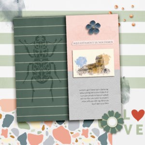
Very soft clash, more of a bump.
Remember, there are no rules when it comes to pattern clashes. The key is to have fun and be creative. So experiment with different colors, scales, and shapes, and see what combinations you can come up with.
3 How pattern clash can be used to create a unique design
Pattern clashes can be a great way to add some visual interest and variety to a design. By definition, a pattern clash is the intentional combining of two or more patterns that normally wouldn’t go together. This can be done in a number of ways, but some of the most common are listed below:
-One pattern can be layered over another
-Two patterns can be placed side-by-side
-One pattern can be used as an accent within another larger pattern
No matter how you chose to combine patterns, there are a few important things to keep in mind. First, you’ll want to make sure that the overall design still feels cohesive. This can be achieved by sticking to a limited color palette, using similar shapes and motifs, or keeping the overall scale of the patterns similar.
Next, you’ll want to consider the proportion of each pattern. Too much of one pattern can make the design feel heavy-handed, while too little can make it feel bland. Finding the right balance is key.
Finally, have fun with it! Pattern clashes are all about breaking the rules and pushing the boundaries. So don’t be afraid to experiment and see what works best for your design.
The photo is not stellar here. The pattern clash brings it to life.
4 How to select patterns that will work well together
When it comes to layout design, using pattern clashes can create a unique and stylish design. However, it is important to select patterns that will work well together. There are a few things to keep in mind when selecting patterns:
Clashing softly.
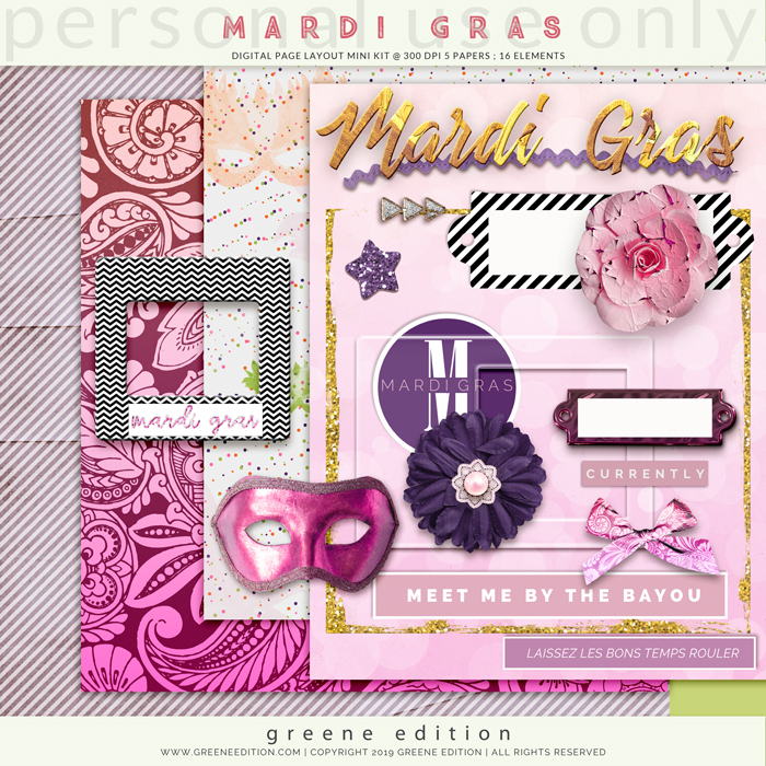
Lots of opportunity to pattern clash with the Mardi Gras page layout kit
1. The scale of the patterns. If the patterns are too similar in size, they may appear busy and overwhelming. However, if the patterns are too different in size, they may look disconnected and unfinished. Try to find patterns that are different enough in scale to create interest, but similar enough to harmonize.
2. The colors of the patterns. It is important to select patterns with colors that complement each other. This will create a cohesive design.
3. The textures of the patterns. Selecting patterns with different textures can add dimension and visual interest to a design.
4. The overall aesthetic. Make sure to select patterns that fit with the overall aesthetic of the space. This will ensure that the design looks pulled together and polished.
Pattern clash is choosing the right colors that work well together, interesting textures and patterns, and a good overall aesthetic.
5 Successfully incorporating pattern clash into a design
If you’re interested in using pattern clashes in a unique design, there are a few tips to help you to make sure the design comes together successfully. First, it’s important to have a clear vision for the overall design. This will help you determine which patterns will work well together and create a cohesive design.

Thanks to Deanne for this layout full of fun pattern clash.
In addition to having a clear vision, it’s also important to be intentional with your pattern placement. This means to plan out which areas of the design will feature which patterns. By doing this, you can avoid an overly busy or chaotic design.
Once you have a plan for your pattern placement, it’s time to start bringing the design to life. When working with pattern clashes, it’s often helpful to start with one larger pattern and then add in smaller patterns to complement it. This will help the design feel more balanced.
As you’re adding patterns to the design, be sure to pay attention to the overall color scheme. This is important for any design, but is especially important when working with pattern clashes. By carefully selecting colors that work well together, you can create a design that is visually appealing and unique.
Finally, don’t be afraid to experiment! Pattern clashes can be a great way to add interest and personality to a design. So go ahead and experiment with different patterns and color schemes until you find a combination that you love.
6 Ways to use pattern clash to add interest to a layout
Incorporating pattern clashes into your home décor can add an element of fun and surprise, as well as visual interest. Here are a few ways to do so:
1. Use patterned paper on one side of a page, then use minimal patterns or solids. Choose a pattern with a bold, graphic print for maximum impact.
Easy, peasy clash. Graphics Marisa Lerin.
2. Incorporate a patterned mat. Again, choose a bold print to make a statement. You can either coordinate the mat with the other patterns on the page, or go for a completely different look.
3. Use patterned fabrics for your frames. Choose coordinating textures for a pulled-together look, or clash patterns for a more eclectic feel.

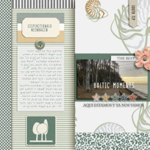
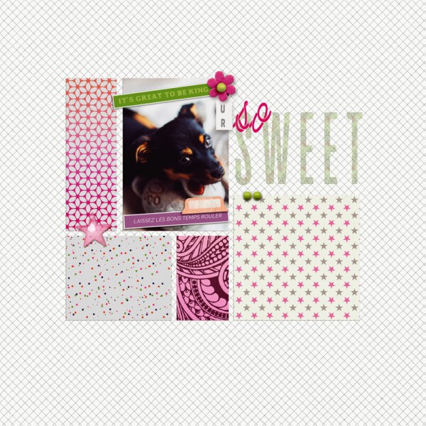
Thanks to Lidia Grad for this beautiful page. Classy clash of stripes and florals and a handful or two of scattered ellies beautifully emphasize both photos.
4. Add some patterned papers to a stack of papers under your image Choose different patterns and colors for a fun, eclectic look.
5. Introduce patterned elements or ephemera. This is a great way to add a pop of color and personality to your page.
 7 Examples of successful pattern clash designs
A pattern clash is when two or more patterns are used together in a design, often in an unexpected way. When done well, pattern clashes can add visual interest and a sense of fun to a design. Here are a few examples of successful pattern clashes:
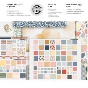
pattern clash with All You Need again
1. Plaid and stripes are a classic pattern clash. This combo can be seen in everything from fashion to home decor. To avoid a chaotic look, try using similar colors or tones in your plaid and stripes. For example, a red and white buffalo check paired with red and white stripes.
2. Florals and geometric patterns are another great combination. Again, using similar colors will help to create a more cohesive look. Try a bold, abstract floral print combined with a geometric pattern in a complementary color.
All You Need offers ample opportunity to pattern clash
3. Polka dots and stripes are a fun and playful combination. This is a great option if you want to add a bit of whimsy to your design. For a more sophisticated look, try using polka dots in a smaller scale and stripes in a larger scale.
4. Animal print and plaid is a daring combination that can really make a statement. If you want to try this look, keep the rest of your design simple and let the pattern clash be the star of the show.
5. Paisley and abstract patterns are an interesting combination. Paisley is a very intricate pattern, so pairing it with a more simple abstract pattern allows the two to really stand out. Try using a paisley in a light color with a bold abstract pattern in a dark color.
Pattern clashes are a great way to add visual interest to your page. So don’t be afraid to mix and match!
If you want to create a unique design, then you should consider using pattern clashes. By pairing two or more patterns together, you can create a look that is both eye-catching and stylish. Pattern clashes can be used in a variety of ways, so be creative and experiment until you find a combination that works for you.
Here is a great way to experiment with pattern clash in my Design Challenges at Digitalscrapbook.com. Join us in the Spring Creation Call Challenge and the May Designer Challenges
Here is a fantastic article by the wonderful Carole Asselin, aka Cassel, on a very effective design principle that perfectly compliments pattern clash: repetition. Thanks to Carole for featuring my pages!