
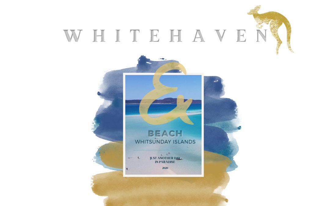
5 Layout Hacks
Hello and thanks for stopping by at greene edition today. Thanks for all of your lovely notes and emails. It is really so very nice to get this sort of feedback and I am very grateful for your lovely input and sharing of ideas. At this point I do want to come back to a recurring topic of feedback that I am getting from you. A few of you have asked me to share how I go about layouting a page. I feel very flattered and just as happy to share. A couple of years ago I have shared my work flow but it is evolving toward portrait format pages.
Please also see this page about my general workflow and scroll down to the bottom for some useful freebies including layout templates. If you have visited me here before you already might know that I am more concerned with memory pages than with ornateness. That does not mean that I dislike ornate pages. They are my second step tho. First and foremost the memory page is my main concern.
I have identified my favorite 5 layout hacks and I am sharing them here today. 5 layout hacks that make layouting really fast and easy.
Here are 5 layout hacks
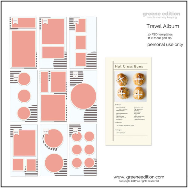
1.Template
Using a template is an easy way to start a page, you do not have to stick to it. I have recently noticed that I love frame templates.
2.Downsize
The big old 12×12 page is a lot to layout on. I have found that portrait sized pages as in 8×10 are easier to layout for me, and since I love smaller sized books I got into notebook layouts and am quite happy with A5 or DL
3. Contrast And Latitude
Mixy, mixy; matchy, matchy! Oh my eyes get really scratchy? Is a feeling that I get when I look at some of my pages. I sometimes feel that pages are over- matched in terms of color and consequently they lack contrast. So a good way to test this is to convert your page into black and white. If I do not see black and white the page is probably a bit matchy. You want to make sure your page has both, black and white when it is desaturated.
When my page is only gray and does not include black and white when desaturated I am never happy with the color version. Recently I am more aware of the fact that the absence of black washes out any layout and creates an imbalance that needs to be countered somehow.
4. Fonts
A title, made up of different fonts and colors or just one for that matter, is a strong element on any page and leaves room and time for the story to be told. Transparency shifts and dissolve are two things I use a lot on titles. The body must be legible (that being the whole point of the text), a sans serif is my choice 85% of the time these days.
5.The 5 W’s
Include them. I have started to include url’s from gutenberg where I like to grab texts from. The old W’s: What, when , where, who, why. They are a fun and useful way to layout a page. Wordstrips or journal brushes are two ways to include the 5 W’s.
Using some or all of these 5 layout hacks on a DL or A5 page (5×7) you will find that your page is pretty much layouted. Any room left ? Go for it. Fasten your pics, add shades and look again. Want a playful look? Try some flowers, leaves, brushes or fun paper strips. Want an artsy look? Try a mask or overlay for your photo. Visit my Pixel Scrapper Gallery here.
Trackbacks/Pingbacks