Classifying Fonts: From Serif to Script
There are four traditional classifications of fonts: serif, sans serif, script and decorative.
Serif fonts have small lines at the ends of their strokes, while sans serif fonts do not.
Script fonts are designed to imitate human handwriting, while decorative fonts are.
Friends often ask me how to tell different types of fonts apart. Here’s a crash course in the four traditional classifications of fonts: serif, sans serif, script and decorative.
Serif fonts have small lines at the ends of their strokes, while sans serif fonts do not. Serif fonts are often seen as more traditional, and are commonly used in print publications such as books and newspapers.
Sans serif fonts are thought to be more modern and sleek, and are often used in digital media.
Script fonts are designed to imitate human handwriting, while decorative fonts are simply for decoration and are not meant to be read.
Script fonts can be casual or formal, and are often used for invitations and greeting cards. Decorative fonts should be used sparingly, as they can be hard to read.
1. What are the different types of fonts? 2. What are the characteristics of each type of font? 3. What are the most popular fonts in each category? 4. How do you choose the right font for your project?
5. What are some common mistakes people make when choosing fonts? 6. How can you combine different fonts in a project? 7. What are some general tips for working with fonts?
1. Classifying Fonts: What are the different types of fonts?
There are four major groups of fonts: serif, sans serif, script, and decorative. Serif fonts are the most traditional and include Times New Roman, Georgia, and Garamond. Sans serif fonts are more modern and include Arial, Helvetica, and Verdana. Script fonts are designed to mimic handwritten letters and include brush script, cursive, and calligraphy. Decorative fonts are unique and include art deco, graffiti, and Futura.

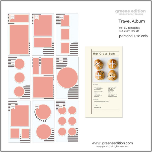
[b]Fonts[/b] Big Caslon and Bebas [b]Graphics[/b] Marisa Lerin, Sharon-Dewi Stolp, Janet Scott, Elif Sahin as attriuted. Pink paper by silke papier studio [b][url=https://www.pixelscrapper.com/sharon-dewi-stolp/kits/farm-fresh-extra-papers-kit-homestead-breakfast-strawberry-jam-chicken-eggs]Farm Fresh Papers by Sharon Dewi Stolp[/url][/b]
2. Classifying Fonts: What are the characteristics of each type of font?
Most people are familiar with the three main types of fonts: serif, sans serif, and script. Here, we’ll take a more in-depth look at the characteristics of each type. Serif fonts are the most traditional type, and are often seen as more formal or classic. They are named for the small lines that extend from the end of each letter’s main strokes (these are called “serifs”).
Because of these extra details, serif fonts can be harder to read when used in large blocks of text. They are better suited for small amounts of text, such as in headlines or body copy that is set in smaller point sizes.
Sans serif fonts are more modern in appearance, and are often seen as more clean and minimalist. As their name suggests, they don’t have any serifs extending from the letter strokes. This makes them much easier to read in large blocks of text.
They are also generally a good choice for headlines, particularly when used in larger point sizes. Script fonts are the most decorative type, and are often used for invitations or other formal documents. They are based on the fluid, cursive strokes of handwritten text. Because of their complex details, script fonts can be difficult to read, and are best used for short amounts of text, such as headlines or slogans.
When choosing a font for your project, it’s important to consider the type of message you want to communicate. Serif fonts are classic and formal, while sans serif fonts are modern and clean. Script fonts are decorative and should be used sparingly. Most importantly, always consider how easy the font will be to read.
3. Classifying Fonts: What are the most popular fonts in each category?
When it comes to fonts, there are a few that stand out in each category as being the most popular. In the category of serif fonts, the most popular is Times New Roman. This font has been around for centuries and is still widely used today, especially in print media. In the category of sans-serif fonts, the most popular is Arial.
This font is used often because it is easy to read and looks good on a variety of different screen sizes. In the category of script fonts, the most popular is Comic Sans. This font is often used for casual, fun projects because of its playful appearance.

Alesia Kozik at Pexels
4. Classifying Fonts: How do you choose the right font for your project?
When it comes to choosing the right font for your project, there are a few key things to keep in mind. First, you need to think about the overall tone or feel that you want to convey. Are you going for something formal or informal? playful or serious? Additionally, you need to consider the audience you’re targeting. What kind of message do they need to receive?
Once you’ve considered the overall tone and audience for your project, you can start narrowing down your font choices. If you’re looking for something formal, you might want to stick with a classic serif font.
For a more playful or creative project, try out a script font. And if you’re aiming for something in between, there are plenty of options to choose from, including sans-serif, display, and hand-drawn fonts.
The most important thing is to experiment with different fonts and see what feels right for your project. There’s no wrong answer, so don’t be afraid to try out a few different options before settling on the perfect one.
5. What are some common mistakes people make when choosing fonts?
When it comes to choosing fonts, there are a few common mistakes that people tend to make. One of the most common is not taking into account the readability of the font. This is especially important if you’re choosing a font for body text. A font that is too difficult to read can make your readers lose interest quickly.
Another common mistake is choosing a font that is too similar to other fonts in the same document. This can make your text look busy and can be confusing for your readers.
 It’s important to choose fonts that contrast well with each other so that your text is easy to read and digest. Similarly, avoid choosing fonts that are too similar to the default fonts on your computer. These fonts are overused and can make your text look generic. If you want your text to stand out, it’s important to choose a unique font that will grab your reader’s attention. Finally, don’t be afraid to experiment with different fonts.
There are thousands of fonts out there to choose from, so take some time to explore all of your options. Try out a few different fonts before settling on one for your project.
6. How can you combine different fonts in a project?
When it comes to combining different fonts in a project, there are a few things to keep in mind. First, you want to make sure that the fonts you choose complement each other. This means choosing fonts that have a similar feeling or tone. For example, if you’re going for a vintage look, you might pair a serif font with a script font. Second, you want to make sure that the fonts you choose don’t compete with each other. This means avoiding fonts that are too similar in style or weight.
For example, you wouldn’t want to pair a thin, delicate script font with a thick, bold sans serif font. Finally, you want to make sure that the fonts you choose are legible. This means choosing fonts that are easy to read, even when they’re used together. A good rule of thumb is to pair a sans serif font with a serif font. This contrast will help make your text more legible.
When it comes to combining fonts, it’s important to use your judgement. What looks good on paper may not always work in practice. The best way to figure out if a combination of fonts works is to experiment. Try out a few different combinations and see which ones you like the best.

Tara Winstead at Pexels
7. What are some general tips for working with fonts?
When it comes to working with fonts, there are a few general tips to keep in mind. First, it is important to have a clear understanding of the different types of fonts. There are four main categories of fonts: serif, sans serif, script, and decorative.
Each category has its own distinct look and feel, so it is important to choose the right type of font for the project you are working on. Another important tip is to be aware of the different features that each font offers. Some fonts have multiple weights (e.g. light, regular, bold, etc.), while others offer different styles (e.g. italic, oblique, etc.).
Some fonts even come with built-in features like small caps and ligatures. Knowing what each font offers will help you choose the right one for your project. Finally, when working with fonts, it is important to keep your audience in mind. Different fonts convey different messages and can create different impressions. For example, a more formal project might require a serif font, while a more casual project might be better suited for a sans serif font. Choosing the right font for your project will help ensure that you are conveying the message you want to send.
Once you have a basic understanding of the different font types, you can start to get a feel for which fonts work well together and which fonts clash. By understanding the different styles of fonts, you can create a harmonious and visually appealing document.