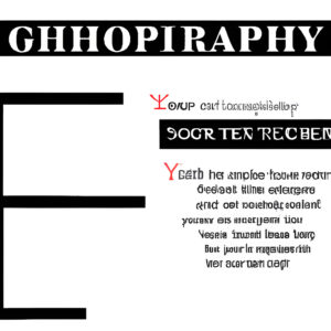
Fonts in Digital Scrapbooking
Graphic design is an ever-changing field. New technologies and design trends are always emerging, which can make it hard to keep up. However, one thing that has remained constant is the importance of typefaces. A good typeface can make a big impact on your design, and there are many to choose from. Here are 10 typefaces that will make you rethink graphic design.
1. Sans-serif fonts are the best for body text 2. Serif fonts are better for headlines 3. Display fonts are great for statements 4. Cursive fonts can add a touch of class 5. Script fonts are perfect for invitations 6. Decorative fonts are ideal for headlines 7. Handwritten fonts are best for displays
1. Sans-serif fonts are the best for body text
When it comes to body text, sans-serif fonts are often seen as the best option. This is because they are considered to be more readable than serif fonts, which can often be seen as too decorative or difficult to read at smaller sizes. Sans-serif fonts are also seen as more modern and sleek, making them a popular choice for websites and marketing materials. However, there are still some who prefer serif fonts for body text, as they feel that sans-serif fonts can be a little too impersonal.
Ultimately, the best typeface for body text is the one that is most readable and that fits the overall tone of the design. For sans-serif fonts, some popular choices include Arial, Helvetica, and Verdana.
A balanced layout design.
2. Serif fonts are better for headlines
Serif fonts are often thought of as being better for headlines than sans-serif fonts. The reason for this is that serifs can help to guide the eye along the line of text, making it easier to read. Sans-serif fonts, on the other hand, can appear to be more cluttered and can be more difficult to read.
Of course, there are exceptions to every rule, and there are some great sans-serif fonts out there that work perfectly well for headlines. But if you’re looking for a font that’s easy to read and will make your headlines stand out, then a serif font is usually the way to go.
3. Display fonts are great for statements
What are display fonts? Simply put, they are fonts that are meant to be used for headlines, titles, and other text that is meant to be seen from a distance. They are often bold, eye-catching, and easy to read. While some designers swear by display fonts, others find them to be overused and overdone. However, when used sparingly and in the right context, a display font can really make a statement. Here are 10 typefaces that will make you rethink graphic design:
1. Arial Black 2. Bank Gothic 3. Bebas Neue 4. Bpreplay 5. Cooper Black 6. Futura 7. Gill Sans 8. Helvetica 9. Trajan 10. Times New Roman
While some of these fonts are more commonly used than others, they all have one thing in common: they are eye-catching and easy to read. Whether you love them or hate them, there’s no denying that these fonts make a statement.
4. Cursive fonts can add a touch of class

We’ve all seen those loopy, swirly fonts and thought to ourselves – cursive looks so much more sophisticated than print. And we’re not wrong! Cursive fonts can really add a touch of class to your designs. When used correctly, cursive fonts can give your work a luxurious feel. They can also make it look more personal and intimate. Cursive fonts can be very versatile – they can be used for formal or informal designs, depending on the style of the font. If you’re looking to add a touch of class to your next design project, here are 10 of the best cursive fonts to choose from:
1. Baskerville 2. Bodoni 3. Garamond 4. Goudy 5. Trajan 6. Copperplate 7. sabon 8. Perpetua 9. Walt Disney Script 10. Zapf Chancery
5. Script fonts are perfect for invitations
When you hear the word “script,” you might think of handwriting, which is one type of script. But there are many other types of script fonts, and each has its own unique personality. Script fonts can be formal or informal, serious or playful. They can be used for invitations, announcements, and other special occasions. Here are five script fonts that will make you rethink graphic design:
1. Bickham Script Pro Bickham Script Pro is a formal script font with a classic look. It’s perfect for invitations, thank you cards, and other formal occasions.
2. Brush Script STD Brush Script STD is a playful script font with a casual look. It’s perfect for party invitations, birth announcements, and other casual occasions.
3. Cursive Standard Cursive Standard is a serious script font with a classic look. It’s perfect for thank you cards, certificates, and other formal occasions.
4. Edwardian Script ITC Edwardian Script ITC is a formal script font with an elegant look. It’s perfect for weddings, anniversary parties, and other formal occasions.
5. Vivaldi Vivaldi is a playful script font with a fun and casual look. It’s perfect for birthday parties, baby showers, and other fun occasions.
6. Decorative fonts are ideal for headlines
Decorative fonts can be used for headlines, but they should be used sparingly. When used correctly, they can add visual interest and draw attention to important information. However, if they are overused, they can be overwhelming and difficult to read. Some examples of decorative fonts that can be used for headlines include:
1. Ornamental 2. Script 3. Display 4. Blackletter 5. Decorative 6. Graphic
Ornamental fonts are often very elaborate and can be used to add a touch of luxury or sophistication to a design.
Script fonts can be used to add a personal touch, or to create a more tactile and organic feel.
Display fonts are bold and attention-grabbing, perfect for headlines that need to stand out.
Blackletter fonts are dramatic and intense, making them ideal for creating an impactful statement.
When choosing a decorative font for a headline, it is important to consider the overall tone of the design. If the design is already busy or cluttered, a decorative font will only add to the visual noise. It is also important to ensure that the font is legible, as headlines that are difficult to read will defeat the purpose of using a decorative font in the first place. With so many amazing fonts available, it can be tempting to use a decorative font for every headline. However, it is important to use restraint and only employ these fonts when they will truly enhance the design. When used correctly, decorative fonts can add personality, elegance, and visual interest to a design.
7. Handwritten fonts are best for displays
There’s no doubt that handwritten fonts add a touch of personality to any design. They’re perfect for displays and attention-grabbing headlines, but there are a few things to keep in mind when using them. For starters, handwritten fonts can be difficult to read at small sizes, so they’re usually best used for larger text. And because they’re so distinctive, it’s important to use them sparingly – too much of a good thing can quickly become overwhelming. When used judiciously, handwritten fonts can add a real sense of style to your designs. Here are 10 of my favourites:
1. Black Jack by Typadelic 2. Café Creme by just me54 3. Charleston by Sandra Dailey 4. Lemonade by doublethink 5. selfish by SInstall 6. Smoothie Shoppe by Lezethan 7. Spirited by Type Associates 8. Sweetly Broken by ShyType 9. Unkempt by Craig Rohloff 10. Vaguely Repulsive by brittneymurphy
If you’re graphic designer, it’s important to stay current on the latest trends in typefaces. However, there are some tried-and-true classics that will never go out of style. In this article, we’ve compiled a list of 10 typefaces that we think will make you rethink your approach to graphic design. From traditional serifs to modern sans-serifs, there’s a typeface here for everyone. So take a look and see which one speaks to you.