The Power of Emphasis in Graphic Design
For many people, the word “design” brings to mind a very specific image: a stylized logo, a carefully curated color palette, and maybe a cool font or two. But design is so much more than just aesthetics. Good design is about creating a visual language that communicates a message clearly and effectively. And one of the most important tools in a designer’s toolbox is emphasis.
Emphasis is the use of visual elements to draw attention to certain parts of a design. It can be used to highlight important information, create a sense of hierarchy, or add visual interest. When used effectively, emphasis can make a big impact on the overall look and feel of a design. There are a few different ways to create emphasis in a design.
One is to use size to your advantage. Make important elements larger than the rest, or use contrasting colors to make them stand out. Another way to create emphasis is to use position. Place important elements in strategic locations on the page, or use whitespace to draw attention to them. Using emphasis is a great way to add visual interest to a design and to ensure that your message is communicated clearly, the next time you’re working on a page layout.
1. The power of emphasis in graphic design 2. How to use emphasis techniques in your design 3. The different types of emphasis in graphic design 4. The benefits of using emphasis in your design 5. The importance of Balance in design 6. How to create visual hierarchy with emphasis 7. Tips for using emphasis in your design


1. The power of emphasis in graphic design
Design teams often use a technique called “emphasis” to help viewers see what they want them to see first. By making some words or images larger, brighter, or a different color than the others, designers can attract attention and control how viewers process information.
One type of emphasis is called “focal point.” This is when designers use an element to draw attention to a particular area of the design. For example, if a graphic has both text and images, the designer may want to make the text the focal point so that viewers will read it first. To do this, they might make the text larger or a different color than the rest of the design.
Another way to create a focal point is to use negative space. This is when designers intentionally leave an area empty to draw attention to the element surrounding it. For example, they might put a small image in the center of a large, empty space.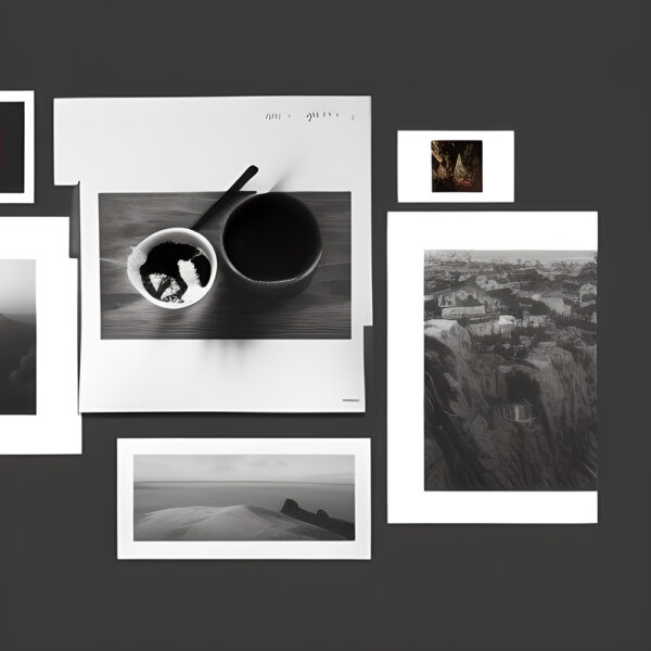
Designers can also use emphasis to create a sense of movement or “flow” in a design. This is often done by making the elements in a design lead the viewer’s eyes from one area to another. For example, they might put a series of images in a row and gradually increase their size so that viewers’ eyes are drawn from left to right. Or, they might put a series of images in a circle so that viewers’ eyes move around the design.

Creating a sense of movement can be helpful when designers want viewers to see all the elements in a design. For example, if a website has a lot of text, designers might use movement to lead viewers’ eyes down the page so they don’t miss anything. Or, if an infographic has a lot of information, designers might use movement to lead viewers from one section to another.
Emphasis can also be used to create a sense of hierarchy. This is when designers use size, color, or other elements to show which parts of a design are more important than others. For example, they might make the title of a document larger than the body text to show that it’s more important. Or, they might use color to emphasis certain elements, like making the headline of an article a different color than the rest of the text. Hierarchy can be helpful when designers want to guide viewers through a design.

Hierarchy in text heavy pages
For example, if a document has a lot of text, designers might use hierarchy to help viewers find the most important parts. Or, if an infographic has a lot of information, designers might use hierarchy to lead viewers from the most important information to the least important.
Emphasis is a powerful tool that designers and layouters can use to control how viewers see and understand a design. By using size, color, movement, and hierarchy, designers can attract attention, create a sense of movement, and show which parts of a design are more important than others.


2. How to use emphasis techniques in your design
Graphic design is all about creating visual interest, and one of the most important ways to do this is through the use of emphasis. Emphasis is the process of making an element stand out from the rest of the design, and it can be achieved through the use of size, color, position, and/or other elements. When used correctly, emphasis can help guide the viewer’s eyes through a design and emphasize the most important elements. It can also be used to create a sense of balance or hierarchy within a design.

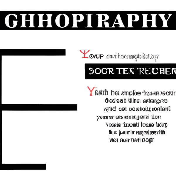
A cluttered page, with too much emphasis consequently lacking focus. All images Bina Greene.
Too much emphasis, however, can make a design appear cluttered or confusing, so it’s important to use emphasis techniques sparingly and only when they will enhance the overall design. There are several ways to create emphasis within a design.
One of the most common is to use size to make an element stand out. This can be done by making it larger than the surrounding elements, or by using contrasting colors or patterns.
Position is another way to emphasize an element; by placing it in the center of the design or at the edge, you can make it more noticeable.
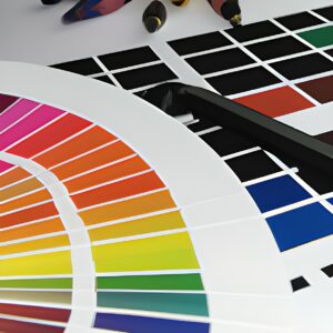
Color is also a powerful tool for creating emphasis. A common technique is to use a light color against a dark background, or vice versa. You can also use complementary colors to make an element pop.
Another way to use color for emphasis is through the use of textures or patterns. By using a different color or pattern for an element, you can make it stand out from the rest of the design. In addition to size, color, and position, you can also use other elements to create emphasis. This includes using contrasting shapes or patterns, as well as adding embellishments such as shadows, outlines, or 3D effects.
When used correctly, emphasis can be a powerful tool for creating interest and focus within a design. By understanding the different techniques available, you can use emphasis to improve the overall look and feel of your designs.


3. The different types of emphasis in graphic design
The three types of emphasis in graphic design are Typography, Icons, and Images.
Typography is the art and technique of arranging type to make written language legible, readable, and appealing when displayed.
 The arrangement of type involves selecting typefaces, point size, line length, line-spacing, and letter-spacing, and adjusting the space within letters pairs. Typography is an important element of graphic design, whether the medium is print, digital, or a sign on the side of a bus. Good typography can make a piece of writing easy to read and understand, as well as visually appealing. Icons are a form of emphasis that can be used in graphic design.

Icons are often used to represent different concepts or ideas, and can be used to make a design more graphical and visually appealing. Icons can be simple vector shapes, or more complex and detailed illustrations.
Images are also a form of emphasis that can be used in graphic design. An image can be used to add visual interest to a design, as well as to convey a message or concept. Images can be photographs, illustrations, or icons.
4. The benefits of using emphasis in your design
Graphic design is all around us, in the newspapers we read, the magazines we browse, the websites we visit, the books we read, and the product packaging we see in the stores. It’s estimated that the average person is exposed to over 3,000 marketing messages every day. In this cluttered landscape, it’s more important than ever for designers to create visuals that stand out and grab attention.
all images Bina Greene
One way to make a visual stand out is to use emphasis. Emphasis is the representation of a concept as the most important element in a composition. It can be achieved through the use of size, color, position, and/or shape. When used effectively, emphasis can guide the viewer’s eye to the most important information and create a strong visual impact.
Benefits of using emphasis in your design include:
-Making sure the most important information is seen
-Guiding the viewer’s eye through the composition
-Making a visual impact
-Creating visual interest
-Drawing attention to a particular element
As you can see, using emphasis in your design can be a powerful tool to achieve a variety of objectives. When used effectively, it can help to communicate your message more effectively and make your visuals more impactful.
5. The importance of Balance in design
In any design, be it a website, a poster, or even a business card, balance is important. A design that is too heavily weighted on one side or the other can look unprofessional, or even amateurish. A well-balanced design, on the other hand, looks polished and put-together. Balance can be achieved in a number of ways, but the most important thing to remember is that every element in the design should contribute to the overall look and feel of the piece. That means that everything from the colors to the fonts to the spacing should be carefully considered.
A balanced layout design.
One way to achieve balance is to use symmetrical design. This means that the elements on one side of the design mirror those on the other side. This can be a very effective way to create a sense of stability in a design. Another way to achieve balance is to use asymmetrical design. This means that the elements on one side of the design are different from those on the other side. This can be a good way to create a sense of movement or energy in a design.
Whatever approach you take, remember that the key to creating a well-balanced design is to carefully consider all of the elements that will be included. By taking the time to create a design that is balanced, you will create a piece that looks professional and put-together.
6. How to create visual hierarchy with emphasis
In graphic design, visual hierarchy is the arrangement of the design elements in a way that indicates their importance. Creating visual hierarchy is important in order to communicate the most important information to the viewer first, and to ensure that the viewer understands the hierarchy of the information.
There are a few different ways to create visual hierarchy using emphasis.
The first is to use size to create hierarchy.
The second is to use color to create hierarchy.
The third is to use position to create hierarchy.
And the fourth is to use contrast to create hierarchy.
Using size to create visual hierarchy is the most common and effective way to create hierarchy.
By making the most important element the largest, you are immediately communicating to the viewer what is most important.
The rest of the elements can then be sized accordingly, with the second most important element being the second largest, and so on.
Color can also be used to create visual hierarchy.
This can be done by making the most important element a different color than the rest of the elements. This will make it stand out and grab the viewer’s attention. The other elements can then be colored accordingly, with the second most important element being a different color than the third most important element, and so on.

Hierarchy achieved by the use of color.
Position can also be used to create visual hierarchy. This is done by positioning the most important element in the center of the design, and then positioning the other elements around it. This will make the most important element the focal point of the design and the other elements will be secondary.
Contrast can also be used to create visual hierarchy. This is done by making the most important element more contrast than the other elements. This can be done by making it a different color, making it a different size, or by adding a drop shadow or embossing. This will make it stand out from the rest of the elements and grab the viewer’s attention.
7. Tips for using emphasis in your design
Designers use all sorts of tricks to direct the viewer’s attention to the most important parts of their designs. Some of these tricks are quite subtle, while others are very overt. In this section, we’re going to discuss seven tips for using emphasis in your design.
1. Use color to your advantage
Color is one of the most powerful tools in a designer’s toolkit. When used correctly, color can be used to draw attention to the most important parts of your design. When choosing colors for your design, consider using contrasting colors to make certain elements pop. For example, if you’re designing a poster for a rock concert, you might use a bright, neon color for the band’s name to make it stand out.
2. Use size to create emphasis
Another way to create emphasis is to use size. Elements that are larger in size will naturally draw more attention than smaller elements. You can use this to your advantage by making the most important parts of your design larger than the rest. For example, if you’re designing a flyer for a sale, you might make the sale price much larger than the rest of the text.

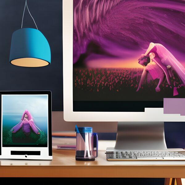
Whitespace, movement, typography, shape and color result in emphasis. All images Bina Greene.
3. Use whitespace
Whitespace is the empty space in your design. It’s the space between your design elements. While it might seem counterintuitive, using more whitespace in your design can actually help to create emphasis. This is because the human eye is naturally drawn to areas of high contrast. So, by including more whitespace around the most important parts of your design, you can actually make those parts stand out more.

Texture used for emphasis.
4. Use texture
Texture is another tool you can use to create emphasis in your design. When an element is textured, it stands out more than if it were smooth. You can create texture in your design by using patterns, or by using different printing techniques such as embossing or debossing.
5. Use shape
Shape is another tool you can use to create emphasis. Elements with sharp, angular shapes tend to stand out more than those with softer, rounder shapes. You can use this to your advantage by making the most important parts of your design more angular.
6. Use direction
Our eyes are naturally drawn to elements that are pointing in a certain direction. You can use this to your advantage by making sure the most important parts of your design are pointing towards the viewer. For example, if you’re designing a banner for a store, you might arrange the text so that it forms an arrow that points towards the entrance.
7. Use repetition
Repetition is another tool you can use to create emphasis. When an element is repeated, it automatically stands out more. You can use repetition in your design by repeating certain elements such as colors, shapes, or patterns.
Overall, the power of emphasis is an important tool in graphic design because it can be used to help viewers process information more easily, draw their attention to certain details, and create a desired emotional response. When used correctly, emphasis can help make a design more effective and impactful.