Adding Emphasis to your Digital-Scrapbook Layouts
When you want to add extra emphasis to certain elements in your digital scrapbook layouts, there are a few different ways that you can go about doing so.
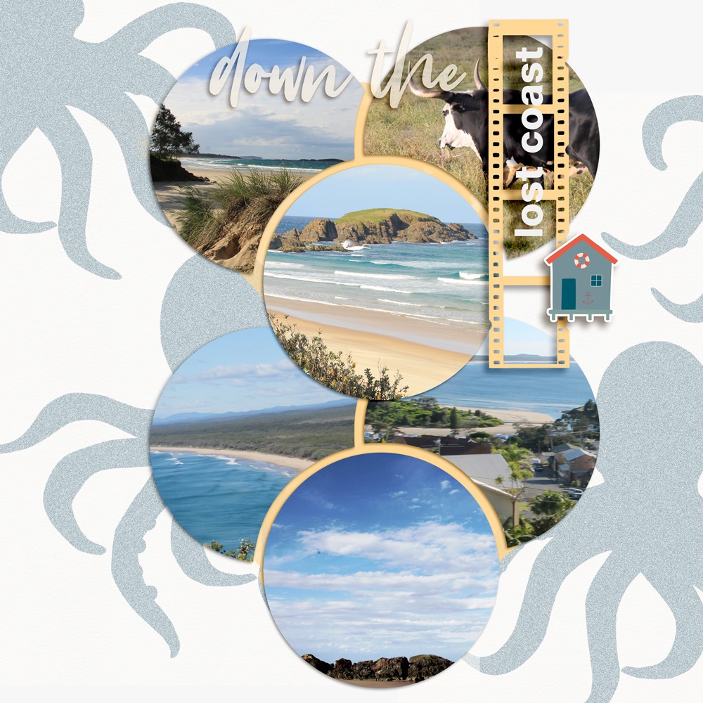
One way is to use a drop shadow. This is a common technique that uses a slightly darker version of the element you’re trying to emphasize, and places it below and to the right of the original element. This will create the illusion that the element is slightly raised off the page.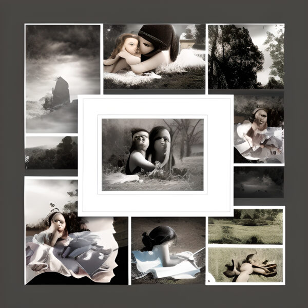
Another way to add emphasis is to use a second, lighter version of the element you’re trying to emphasize. This can be placed above and to the left of the original element, which will give the impression that the element is floating. Both of these techniques can be used to create a more three-dimensional look for your layout, and to add emphasis to specific elements or parts of your page.
1. Why add emphasis to your digital scrapbook layouts? 2. How to add emphasis using color 3. How to add emphasis using white space 4. How to add emphasis using word art 5. How to add emphasis using embellishments 6. How to add emphasis using clustering 7. How to add emphasis using photos
1. Why add emphasis to your digital scrapbook layouts?
Adding emphasis to your digital scrapbook layouts can really help to make them stand out and look more professional. By adding simple things like shadows, perspective, and depth, you can really add a lot of interest to your pages.
One way to add emphasis to your digital scrapbook layouts is to use shadows. By adding shadows, you can create the illusion of depth and dimension. This can be a great way to make your pages look more three-dimensional and give them a more polished look.
Another way to add emphasis to your digital scrapbook layouts is to use perspective. By adding perspective, you can give the illusion of depth. This can be a great way to make your pages look more three-dimensional and give them a more polished look.
Finally, you can also add depth to your digital scrapbook layouts by using different layer styles. By adding different layer styles, you can create the illusion of depth and dimension. This can be a great way to make your pages look more three-dimensional and give them a more polished look.
2. How to add emphasis using color
Adding color to your digital scrapbook layouts can help add emphasis and bring attention to important elements. When adding color to your layouts, there are a few things to keep in mind.
 First, consider the colors that are already present in the photos and other elements on your layout. You don’t want to add colors that will clash or compete with what’s already there.
Second, think about the mood or feel that you want to create with your layout. Certain colors can help create a certain atmosphere. For example, using warmer colors can make a layout feel more inviting and friendly, while cooler colors can make a layout feel more calming and serene. Once you’ve considered the colors that are already present and the mood you want to create, you can start to experiment with adding color to your layout.
One way to do this is to add a colored background. This can be a solid color, or it can be a patterned paper. If you choose a patterned paper, make sure it is a fairly simple design so that it doesn’t compete too much with the other elements on your layout.
Another way to add color is to use colored embellishments. Again, you’ll want to consider the colors that are already present and choose colors that complement them. You can also use color to highlight certain elements on your layout. For example, you could use a light colored frame around a photo to make it stand out.
Adding color to your layouts can help create a certain mood or feeling and can also help to bring attention to important elements. When adding color, be sure to consider the colors that are already present and the mood you want to create.
Experiment with different ways of adding color, such as using a colored background or colored embellishments.
3. How to add emphasis using white space
In this section, we’re going to discuss how you can add emphasis to your digital scrapbook layouts using white space. You can use white space to highlight specific elements on your page, to create a sense of balance, or to simply make your page look more visually appealing.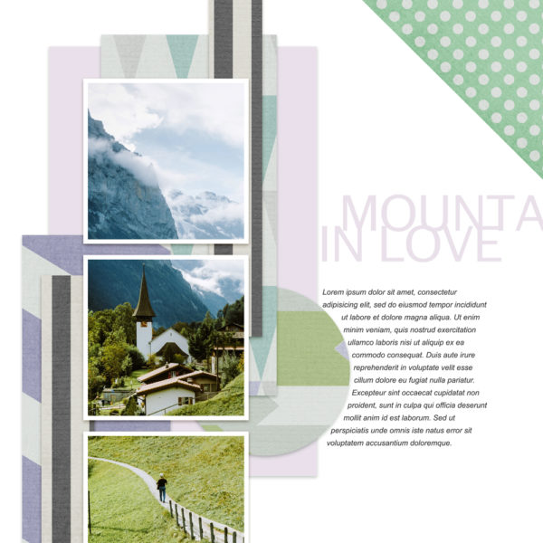
When it comes to scrapbooking, white space doesn’t necessarily have to be white. It can be any color that you want it to be. You can use white space to contrast with other colors on your page, or to complement them. The important thing is to use white space intentionally to achieve the desired effect.
One way to add emphasis to an element on your page is to surround it with white space. This will make the element stand out and give it more visual impact.
You can also use white space to create a sense of balance on your page. For example, if you have a lot of text on one side of your page, you can balance it out by adding some empty space on the other side. Another way to use white space is to add it in between elements on your page.
This can help to create a sense of separation between them and make your page look more organized. You can also use white space to group elements together. For example, if you have a bunch of photos that you want to group together, you can surround them with white space to make them look like a cohesive unit. There are many different ways that you can use white space to add emphasis to your digital scrapbook layouts. Experiment with different techniques and see what works best for you.
4. How to add emphasis using word art
Digital scrapbooking is all about creativity and having fun. And, one way to add a personal touch to your layouts is to use word art. You can use word art to add titles, journaling, or just about anything else you can think of. There are a few things to keep in mind when using word art in your layouts.
First, make sure the word art is legible. You want people to be able to read it, so use a font that is easy to read.
Second, use color to add emphasis. You can use color to make the word art stand out, or to match the colors in your layout. And lastly, use the word art to add a personal touch to your layout.
So, how do you add word art to your layout? First, you need to find some word art that you like. You can find word art online, in magazines, or you can even create your own. Once you have found some word art, you need to decide where you want to place it on your layout.
A good rule of thumb is to place the word art near the center of your layout. Once you have found the perfect spot for your word art, you need to attach it to your layout. And that’s it! By following these simple tips, you can add emphasis to your layouts using word art. So, have fun and be creative!
5. How to add emphasis using embellishments
When looking at a digital scrapbook layout, the first thing that usually stands out is the background. The background can be a solid color, a pattern, or even a picture. Backgrounds can be paper, fabric, or even digital art. The background sets the tone for the rest of the layout and can make or break the design.
The next thing that usually stands out is the title. The title is the largest and most important element on the page. It should be easily readable and contrast well with the background. The title should also be reflective of the theme of the page.
Once the background and title are in place, it’s time to start adding embellishments. Embellishments can be anything from flowers and ribbons to buttons and beads. They are a great way to add interest and dimension to a layout. When choosing embellishments, it’s important to choose items that complement the background and title. Embellishments can be used to create a focal point on the page. A focal point is an area that draws the eye and adds visual interest.
Focal points can be created by clustering embellishments together or by using a large embellishment. Focal points can also be created by using contrasting colors or by adding a pop of color to the page. If you want to add emphasis to a particular element on the page, you can do so by framing it. Framing an element will make it stand out and will give it a polished look. You can frame an element by using a border or by matting it. Another way to add emphasis to a page is by using shadows.
Shadows can be created using a drop shadow or a cast shadow. Shadows can be used to make an element stand out or to add depth to a page. When using embellishments, it’s important to use them sparingly. Too many embellishments can make a page look cluttered and can be distracting. A good rule of thumb is to use no more than three embellishments per cluster. By following these guidelines, you’ll be able to create digital scrapbook layouts that are both eye-catching and stylish.
6. How to add emphasis using clustering
When you want to add emphasis to a particular element in your digital-scrapbook layout, one of the best ways to do so is through clustering. This involves grouping together similar elements in a way that makes them stand out from the rest of the page. Clustering can be used to draw attention to a particular photo or element, or to create a focal point on the page. When clustering elements, there are a few things to keep in mind. First, you want to make sure that the elements you are grouping together share some kind of visual connection. This
could be a similar color, shape, or theme. Second, you want to be aware of the overall balance of the page.
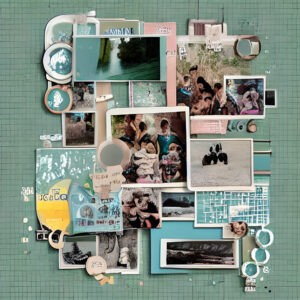
Clustering, collage too busy.
Clustering can make a page look very busy, so you don’t want to go overboard. And finally, you want to make sure that the clustered elements are actually enhancing the page, and not detracting from it. Here are a few tips for clustering elements in a way that will add emphasis to your layout:
– Group together similar elements, such as photos, journaling blocks, or embellishments. – Use a consistent element throughout the cluster, such as a frame or border.
– Offset the clustered elements from the rest of the page using spacing or placement.
– Create a focal point by clustering the largest or most eye-catching elements.
– Use color to create contrast and make the cluster stand out. By following these tips, you can create clusters that will add emphasis and interest to your digital-scrapbook layouts.
7. How to add emphasis using photos
Your photos are the most important part of your digital-scrapbook layouts, so you’ll want to make sure they’re given the emphasis they deserve. Here are seven ways to do just that.
1. Use a large photo as your background. This will give your page an instant focal point, and it’s a great way to show off a special photo. Just make sure to choose a background that compliments your photo, and that doesn’t overwhelm the rest of your design.

Photos and emphasis. All images Bina Greene.
2. Use a frame. Adding a frame around your photo is a great way to make it stand out. You can use a simple, solid-colored frame, or get more creative with an embellished or patterned one.
3. Make a photo collage. If you have multiple photos you want to include, consider making a collage. This will add interest to your layout and help draw the eye around the page. Just be sure not to make your collage too busy.
4. Use a transparency. Transparencies are a great way to add depth and dimension to your layout. They can also be used to tone down a busy background or add interest to an otherwise simple photo.
5. Use shadows. Shadows can help your photos stand out, and they can also be used to create a sense of depth and dimension. Just be sure not to use too many shadows, as they can quickly become overdone.
6. Add a border. Borders are a great way to add interest and emphasis to your photos. They can be simple or elaborate, solid or patterned. Just be sure to choose a border that compliments your photo.
7. Use embellishments. Embellishments are a great way to add interest, texture, and color to your photos. They can be as simple as a few beads or as elaborate as a handmade flower. Just be sure not to go overboard, as too many embellishments can quickly become overwhelming.
Layouts with emphasis tend to be more visually appealing and can help to draw attention to important details within the layout. When adding emphasis to a digital scrapbook layout, consider using a variety of techniques such as adding shadows, changing the opacity of elements, or using a color overlay. Experiment with different techniques to see what effect they have on your layout and choose the ones that help to create the look you are going for.
5th anniversary tutorial: Journaling Made Easy
See all greene edition anniversary tutorials here
greene edition on emphasis here


